Demand for electricity changes through the day
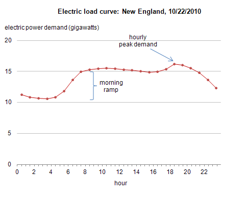
Electric power systems must match generation and load in real time, with tight tolerances. As a result, both system stress and prices can vary considerably throughout the day. Today's chart shows an hourly profile of electric generation throughout an autumn day, October 22, 2010, in New England and underscores three operational factors that can affect price–the morning ramp, the afternoon/evening peak, and the differences between the hourly and five-minute peaks (see second chart).
- Morning ramp. The transition from relatively lower loads to higher loads in the morning is called the "morning ramp." This transition can stress power systems and lead to volatile prices. On this day, the chart shows a distinct morning ramp or increase in load between 5:00 a.m and 7:00 a.m. Responding to such load changes often requires using units that can start up quickly. These units can be more expensive to operate than units that stay on for long periods such as baseload units. Power prices can increase during ramping, sometimes considerably, for short periods.
- Peak demand. The peak demand for electricity is often a time of high price and/or stress. During this period, usually in the early evening, operators need more generating capacity–including more costly "peaking" units. Both day-ahead and long-term forecasts account for these peaks to ensure the assignment of adequate capacity.
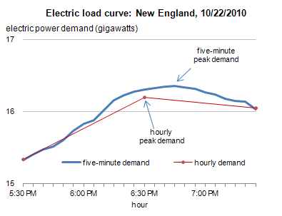
- Hourly and five-minute peaks. The second chart shows hourly and five-minute peak intervals for New England on the same day for the peak 5:30 p.m. and 7:30 p.m. period. These intervals differ slightly because power needs are not uniform even within an hour. Though usually small, this difference can sometimes matter. Regional Transmission Organizations usually report real-time power prices at five-minute intervals, and there are sometimes sharp differences from one interval to the next as the system responds even to relatively small changes in load or generation.
Load curve shapes vary among regions and change with the season of the year. This chart highlights an autumn period in New England that does not, for example, display the additional electric demand for air conditioners (or heaters).
Tags: electricity, New England, prices, states