Transmission congestion drives power price division between upstate and downstate New York
Download CSV Data
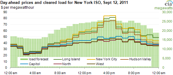
Electric power often costs more in New York City, Long Island, and the Hudson Valley than in the rest of New York—especially for the mid-afternoon—due to transmission constraints on moving power into the New York City area. The chart above, published by the Federal Energy Regulatory Commission (FERC), shows a typical example of diverging prices for those regions in the day-ahead market, where market participants bid to provide electricity for each hour of the upcoming delivery day. Location-specific prices in the day-ahead market respond to expected conditions like transmission constraints; the real-time market responds to the events of the day, such as unpredictable weather events or generator outages.
Last week, Today in Energy used a series of maps to illustrate location-specific prices in wholesale electricity markets (Locational Marginal Prices—LMPs). Comparing prices in different zones over the same time period, however, requires charts like those produced by the Federal Energy Regulatory Commission—daily charts with a few key LMPs for each of five areas of the country served by regional transmission organizations (RTOs).
Differences among LMPs usually boil down to transmission constraints across an RTO. This article takes the New York Independent System Operator (NYISO) as an example. In New York, there is a persistent transmission constraint between upstate and downstate, limiting the amount of electricity that can flow into New York City and Long Island from the north. This situation commonly results in higher prices in New York City, on Long Island, and often in the Hudson Valley (the northern approach to NYC) as well.
The chart above shows the split between upstate (West, Capitol, and North) and downstate (New York City, Long Island, and Hudson Valley) prices in the mid-afternoon on September 12, 2011. Every weekday, FERC publishes a chart of the previous weekday's LMPs as established in the day-ahead market for several RTOs. (FERC includes charts for weekend days in their archive files.) In the example, day-ahead prices for Monday, 9/12 were posted by FERC on Tuesday, 9/13. The chart includes:
- LMPs by zone and by hour, as discussed above, are plotted on the left axis.
- Cleared load is plotted on the right axis, also by hour, for the entire NYISO. Demand for electric power changes over the course of the day. NYISO "clears" a certain amount of load in hourly chunks, to be supplied by generators placing winning bids in the day-ahead market. For this fairly mild September day, hourly cleared load topped out around 26,100 megawatts (MW), nowhere near the load record for NYISO of 33,939 MW, set in 2006.
Even on this fairly lightly-loaded day, however, upstate LMPs diverged from downstate LMPs during the morning ramp, with the split increasing as load increased, up through the afternoon peak between 4 and 5 p.m., and then narrowing at the end of the day. For much of the day, wholesale electricity prices were higher in New York City, Long Island, and the Hudson Valley than in the remainder of New York State.
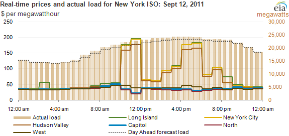
The prices in the chart above apply to the portion of total electric power demand cleared in the day-ahead market. This represents most of New York's electricity supply. For the small additional portion of power required to meet the actual load on a given day, the NYISO also runs a real-time market, which takes and clears bids from generators to supply power on a real-time basis. The 5-minute, real-time prices are averaged over the hour in the chart below, which includes:
- LMPs, plotted on the left axis in dollars per megawatthour
- The actual load observed by NYISO, plotted on the right axis in megawatts
- The forecasted load from the previous day in megawatts.
Download CSV Data
LMPs in the real-time market often behave differently than in the day-ahead market. The real-time market tends to be more volatile, and responds to the events of the day, such as a thunderstorm alert or an unplanned generator outage requiring fast-starting but higher-priced generators to come on line, as seen in PJM on August 23, 2011 when an earthquake hit the East Coast. In the case of the New York chart above, transmission equipment outages upstate in the morning led to higher real-time prices downstate. Because transactions in the real-time market represent only a small portion of total electricity supplied, high real-time prices rarely translate into significant increases in retail power prices. However, sustained high, real-time prices can influence the day-ahead market, as seen in ERCOT during a supply shortage in August 2011.
The charts discussed above are representative of only one report on FERC's website on electric power market oversight; FERC also has a separate website devoted to market oversight for natural gas.
| U.S. RTO Websites | FERC RTO daily reports |
| California ISO | FERC CAISO Daily Report |
| Electric Reliability Council of Texas | (Not regulated by FERC) |
| Southwest Power Pool | (SPP does not produce day-ahead prices.) |
| Midwest ISO | FERC MISO Daily Report |
| PJM Interconnection | FERC PJM Daily Report |
| New York ISO | FERC NYISO Daily Report |
| ISO New England | FERC ISO-NE Daily Report |
Tags: electricity, New York, prices, states, transmission