Peak-to-average electricity demand ratio rising in New England and many other U.S. regions

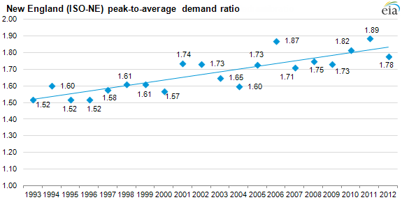
Across the United States, but most pronounced in New England, the ratio of annual peak-hour electric demand to average hourly demand has risen over the past 20 years. In New England, the peak-to-average demand ratio has increased from 1.52 in 1993 to 1.78 in 2012. In other words, the highest peak-hour electric demand for the year in 1993 was 52% above the hourly average level while in 2012 peak-hour demand had risen to 78% above the hourly average level.
This higher ratio translates into decreasing average utilization levels for generators in New England and other regions. Electric systems maintain sufficient capacity to meet expected peak loads plus a reserve margin. As the peak-to-average ratio rises, generators called on to meet peak-hour demand are running fewer hours and/or at lower output levels the rest of the year. Because energy payments are generator's primary source of revenue in regional transmission organization (RTO) systems such as New England's Independent Systems Operator (ISO), the rising ratio of peak-to-average hourly demand is likely cutting into generator revenues and increasing the importance of capacity market payments to generators.
A more nuanced way to look at hourly demand is the construction of what is called a load duration curve. This is the graphical representation of hourly electric demand from highest to lowest over a certain time interval. In the chart above, hourly electric demand in New England for every hour of each year from 1993 to 2012 has been ordered from highest to lowest and indexed to the peak value for each year. It reveals two groups, one between the years 1993 to 2000 and the second between the years 2001 to 2012. EIA does not know the exact reasons for this change, but likely candidates include:
- A rising share of climate control in electricity consumption that leads to greater sensitivity to weather, lifting peak demand levels in the summer relative to average levels for the year
- Changes in consumption technologies and patterns (such as increased energy efficiency) that reduce average electric demand, such as more efficient refrigerators and light bulbs
- Shifts to a more service-based economy (from an industrial base that uses energy more evenly throughout the year)
Because of differences in housing stock, climate, and general economic conditions, the peak-to-average demand ratio can vary considerably by region (see tabs below). Also, because electricity demand is highly sensitive to weather that varies by year, it is best to analyze these trends over several years.
Source: U.S. Energy Information Administration
Both peak and average load levels steadily increased in New England from 1993 to 2005. But beginning in 2006, average load levels have been trending downwards while peak levels have remained more or less flat, leading to a continued increase in peak-to-average demand levels. Throughout this time period, the annual peak load day in each year in New England occurred from June to August except for 1993, when the peak hour happened in February.
Source: U.S. Energy Information Administration
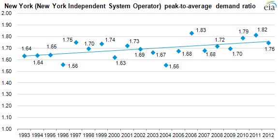
In New York, average hourly demand levels have remained flat to slightly declining beginning in 2006 after steady increases in average demand levels from 1993 to 2005. Peak hour demand levels have remained roughly flat from 2006 on, leading to sustained increases in the peak-to-average demand ratio. The yearly peak hourly demand in New York from 1993-2012 occurred during the June to August time period.
Source: U.S. Energy Information Administration
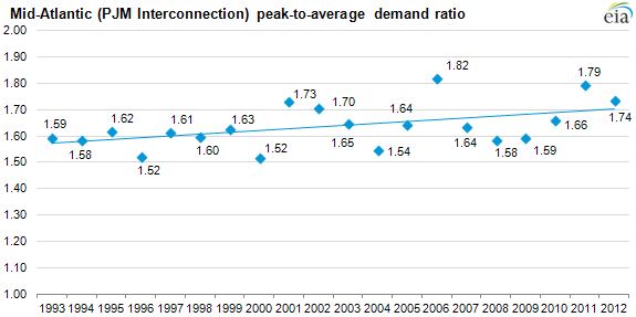
In PJM, both peak and average hourly demand levels have remained on an upward trend through 2012, though average demand has decreased slightly in both 2011 and 2012. For the entire time period, the yearly peak demand hour in PJM occurred in either July or August.
Source: U.S. Energy Information Administration
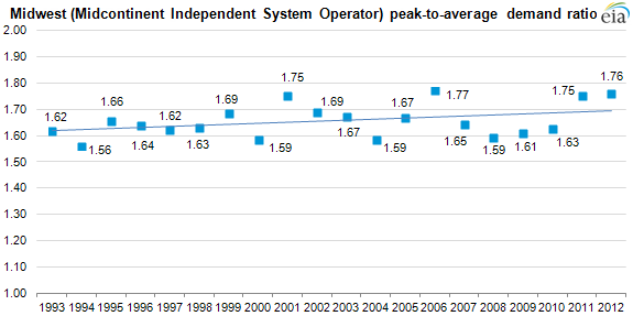
In MISO, peak and average hourly demand levels steadily increased from 1993-2006. After pronounced declines in 2008, average hourly demand levels have remained fairly flat in years prior, while peak hourly demand rebounded in 2011 and 2012. Throughout this period, the annual peak load day in each year in MISO occurred from June to August.
Source: U.S. Energy Information Administration
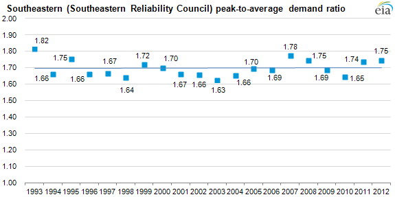
Note: Southeastern Reliability Council is a NERC subregion
In the Southeast, the peak-to-average ratio trend is flat from 1993 to 2013 though the underlying demand trends have changed. From 1993 to 2007, peak and average demand levels rose in tandem fairly steadily year after year. But in 2008 and 2009, peak and average demand fell (likely due to economic conditions) before rebounding in 2010 and remaining fairly flat in 2011 and 2012. Throughout this time period, the annual peak load day in each year in the Southeast occurred from June to August.
Source: U.S. Energy Information Administration
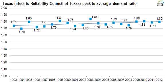
Texas' ever-so-slightly increasing peak-to-average demand ratio has come by way of steady increases in both peak and average hourly demand levels. Throughout this time period, the annual peak load day in each year in ERCOT occurred from June to August.
Source: U.S. Energy Information Administration
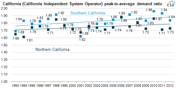
Both peak and average hourly load levels increased steadily in Northern and Southern California from 1993-2006. But in the years since, both peak and average loads have shown a flat to declining trend. Throughout this time period, the annual peak load day in each year in both Northern and Southern California occurred from June to September.
Source: U.S. Energy Information Administration
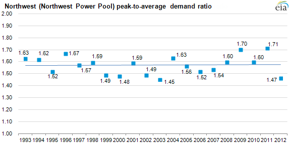
In the Northwest, the trend has been flat for both peak and average hourly demand levels from 1993-2012, outside of short-term year-to-year fluctuations due to weather or economic conditions. Throughout this time period, the annual peak load day in each year in the Northwest occurred from November to February.
Principal contributor: Timothy Shear